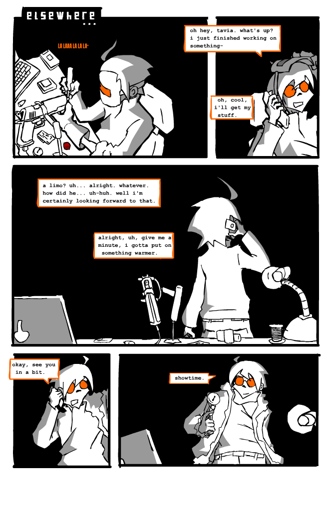
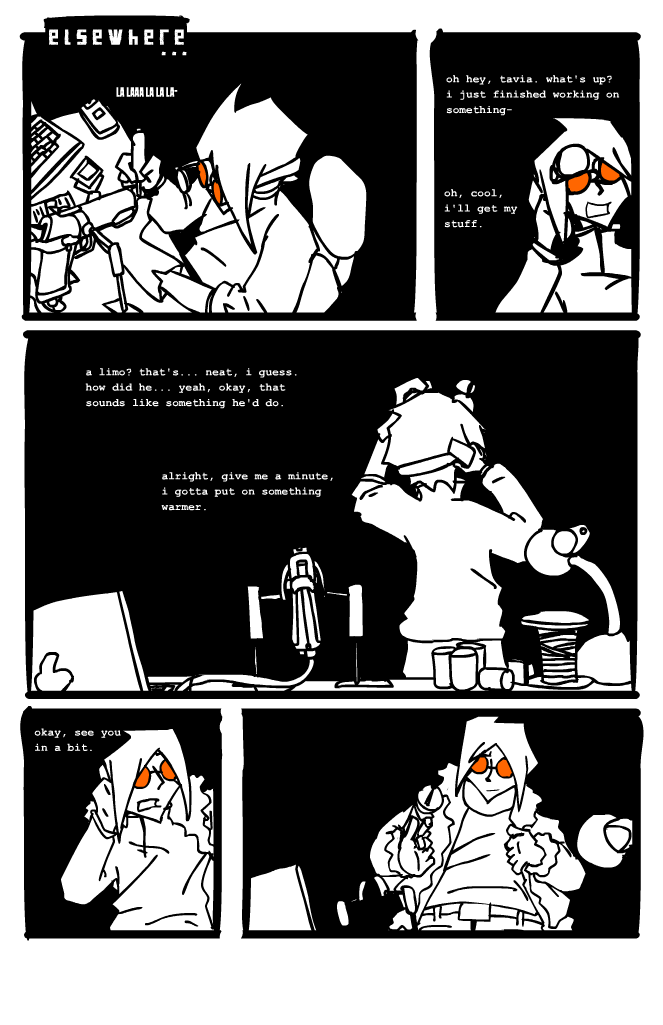
this guy again
It’s this guy again? And why do we still not know his name or his motives? It’s not bad pacing, it’s suspense!
If that wasn’t a satisfying enough answer, you’ll find out next week, faithful readers! In the meantime, don’t forget to participate in the issue title contest!
more updated art. good lord, the original for this was just awful. i was trying to create a sense of contrast between subject and background using something stuffy art people refer to as “chiaroscuro,” but it just plain did not take with the old house style. the new, improved, completely awesome plan is now to use a middle-gray hard shadow whenever there isn’t just flat lighting, which should theoretically retain the trademark faux-monochrome look while being far easier on the eyes.


) Your Reply...